BROWSE BY CATEGORY
- Archives and Libraries
- Blogs and Networking
- Bookmark This
- Digital Tools
- Examples of Teaching
- Exhibits
- Film Reviews
- History and Headlines
- Historic Sites and Museums
- Historical Thinking
- Holidays and Heritage
- Issues and Research
- Lesson Plans
- Material and Visual Culture
- Multimedia
- Organizations and Agencies
- Primary Sources
- Professional Development
- Publications
- Student Activities
- Teaching Materials
- Websites
Diana Laufenberg on the Power of Visuals

History teachers (tend to) love history. Students do not (often) love it so much. This is a perplexing situation that I have bounced around in my brain for the past two decades. When I was a student, I liked the teachers and felt as though I was being educated, but I did not love my history classes. That is until I enrolled in a special freshman seminar at the University of Wisconsin-Eau Claire: "Medieval Foundations of the Modern West," co-taught by a history professor, Dr. Thomas Miller, and an Academic Adviser with an art degree, Jeannie Harms. This course was about nurturing freshmen as students but also approaching history from an interdisciplinary angle. It was incredibly unconventional and I loved every minute of it. There was a significant 'visualness' to the history—we were constantly digging into paintings and illustrations and artifacts of the era to extract their history, for ourselves.
As I developed my own classroom practice, it occurred to me that I needed to include that compelling visual component in my teaching as much as possible. Some years I have been more successful than others at achieving that balance, and there have been years when I was more acutely aware of the need. Consider this student: a 12-year-old girl with a 2nd-grade reading/writing level, identified with a specific learning disability in both areas. She is in my classroom in adherence with the inclusion model. I quickly realize that her struggles with the written word have nothing to do with her capacity for logic and critical thinking. She is bright and actively participates in class discussion, but is left out of the conversation much of the time because the reading and writing stand between her and the ideas. To address her identified areas of struggle, she is scheduled into small, intensive remedial classes, but much of the content is well below her actual intellect; she is bored.
I began to realize that if I introduced the concepts visually, this student was much more motivated to attempt the assignment even though she struggled. In addition, her ability to engage verbally in the discussion and group work related to the content improved. Here's the other bonus moment—introducing concepts in a visual way motivated most of the kids. It helped them to access the ideas or get hooked by the story so that they then wanted, all on their own, to know more, inquire, and dig. Two minutes of historical video on the Space Race can get a room of 13-year-olds completely rapt and intrigued. A famous political cartoon with clever components can provoke a stream of compelling questions. An infographic comparing unemployment rates in the Great Depression to those today can link the personal experiences of the students today to the historical concept of the Great Depression, helping them look for commonality and divergence in the events. As teachers of history we often place reading and writing before discussion, leaving behind those students averse to or struggling with the written word. By flipping the compelling component to the front of the day or lesson, students are much more likely to buy into the learning. I learned this all those years ago in that freshman seminar.
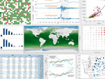
As technology advanced and I began to use more video, I also stumbled across the occasional data visualization. My interest was piqued. These visualizations were not just a way to capture interest but also a way to introduce highly complex ideas and relationships quickly, so as to elevate the level of dialogue and inquiry. One such example is GapMinder from Hans Rosling. If you have never investigated this tool, I dare you to spend less than an hour on your first visit. Watching the bobbing and weaving of country data through time makes the data beautiful and meaningful to many students and fills them with curiosity. The visualizations created by Slate and The Guardian for the unrest in North Africa and the Middle East deliver a deluge of rich information to the learner in forms that suggest connections between events, geography, and time. Tools like these can include the vast majority of learners, regardless of reading ability, in a dialogue of ideas and critical thought.
This is not to say that we shouldn't work with students on their areas of struggle, but we can teach students to access and assess content in more ways than just reading and writing. That 12-year-old girl taught me that seeing a student as a voraciously curious brain and not just a reader/writer was critically important. We teach the whole child, not just the parts that decode letters. Our history classrooms have the ability to become fertile ground where citizens engage in truly enriching dialogue about issues of import. I want to involve all of my students in the conversation, not just those interested in the history or those that can access the reading, but all the students, their interests piqued by engaging and relevant resources about which they can ask thoughtful questions.
For more information
Our Tech for Teachers section introduces you to visualization tools like Many Eyes and Wordle.
Mind mapping and mental mapping are data-visualization techniques students can embrace, and English language learners can also benefit from bringing more visuals into the classroom.
