Free Speech Teaching Guide 3: The Problem of National Security Secrets
This Teaching Guide is part of a series. Each of the four total teaching guides speaks to one aspect of the history of free speech. Although they work together to tell different parts of this history, it is not necessary to teach all of the guides or to teach them in a certain order. Each guide is a self-contained lesson.
(A PDF version of this teaching guide is also available for download-see left)
Other guides in the series:
Free Speech Teaching Guide 1: The Birth of the Modern First Amendment: How Oliver Wendell Holmes Changed His Mind
Free Speech
Teaching Guide 2: Brandenburg v. Ohio (1969): Defining and Arguing Hate Speech
Free Speech Teaching Guide 4: Mandel v. Kleindienst (1972): Censorship via Visa
Recommended for:
- 11th Grade US History
- 12th Grade Government
- Undergraduate History
Table of Contents
Guide Introduction:
This introductory essay provides historical context on the First Amendment, government secrecy, and the rights of leakers and the press. Drawing attention first to more recent examples of these issues, the essay then introduces the 1971 Pentagon Papers leak which segues into a teaching activity on the topic.
Classroom Activities:
Exercise 1: Ellsberg's Memoir. A guided reading of an excerpt from Daniel Ellsberg’s memoir and an introduction to the Supreme Court case. Guiding Question: What’s the line between the government’s national security interest and the right of the public to know what the government is doing?
Exercise 2: Classifying Government Secrets. Small group, then whole classroom activity to help students understand the government classification process.
Exercise 3: Debating the Ellsberg Outcome. A discussion with students about the impact of the Pentagon Papers including the still unresolved legal questions around national security and free speech. Guiding Question: How does democracy operate amongst ambiguity and competing priorities?
Appendix:
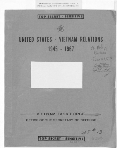
Image of Pentagon Papers Cover
Excerpt of Ellsberg Memoir
Guide Introduction
In the first and second guides in the Free Speech Teaching Guides series, we explored how speech that might cause a crime became increasingly protected under the First Amendment because it became harder to prove that speech, on its own, was harmful. But what if someone leaks a national security secret to the press? Is that sufficiently harmful or sufficiently criminal to allow censorship to protect the secret? This legal issue is inseparable from the question of how information gets classified as a “secret” in the first place. This guide explores the relationship between secrecy and the First Amendment by exploring two interrelated legal problems: the rights of leakers and the press to publish secret information; and the bureaucratic process by which information is classified as secret in the first place.
These issues are at the heart of recent conflicts about whistleblowers and classified information – individuals like Chelsea Manning and Edward Snowden have faced jail time for sharing secrets with the public. The need to protect national security secrets has become a frontline of free speech debates. Introducing students to these topics can seem daunting because the law is complicated and confusing – one Supreme Court justice famously noted that the relevant sections of the Espionage Act are “singularly opaque.” (These are different sections of the same WW1-era law that we looked at in Free Speech Teaching Guide 1 and they remain on the books today.)
My approach to teaching this subject at the introductory level is to focus less on the intricacies of the law than on the political and moral issues raised by the place of secrecy in a democracy. Can the government keep secrets to keep us safe? Or does the public have a right to know what its government is doing? Who gets to decide? The Pentagon Papers case provides an excellent case study to get students debating these questions.
Classroom Exercise 1: Ellsberg's Memoir
Contents:
Overview
Memoir Excerpt, Questions, and Takeaways
Visual Aids
Concluding Concepts
Overview:
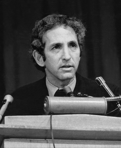
The Pentagon Papers were a 7,000 page, 47-volume history of America’s policy in Vietnam that had been prepared, in secret, by the U.S. government in the late 1960s. Included in this history were the many ways that the U.S. government had lied to the American public about the origins and conduct of the Vietnam War. They were stamped “Top Secret” and very few people had access to them. One of the people who had access to the document was Daniel Ellsberg, a former marine with a Harvard PhD, who had worked in the highest levels of the U.S. government. At first, he was a believer in the American war in Vietnam. In the included excerpt of Ellsberg’s memoir, he wrote powerfully about the ways that access to secret information was intoxicating.
This excerpt can be assigned for pre-class or homework reading or can be done as an in-class exercise. Regardless of modality, the set of questions included in this exercise will help students engage with the source. Finally, the Concluding Context will explain how this case quickly became central to national decisions regarding the rights to free speech and public knowledge.
Exercise Steps:
- Read the Framing Essay and Overview of this exercise yourself and use both to introduce students to this topic.
- Have students read the excerpt of Ellsberg’s memoir either as homework or in class.
- Based on the reading, ask questions and guide conversation.
- Draw on the provided Concluding Context to explain how the Pentagon Papers incident played out politically and legally as far as rights of the press.
Memoir Excerpt, Questions, and Takeaways:
This source can be either a pre-class reading assignment or an in-class exercise. In either case, here are three questions to ask students:
- Why does Ellsberg think that there are relatively few leaks of secret information in the U.S.?
- How does Ellsberg describe the way that having access to secrets made him feel?
- Is this attitude toward state secrets democratic? Explain your reasoning.
The key takeaways for students are:
- That while secrets do leak, it’s surprisingly rare.
- That these leaks are rare largely because there is a glamour to having access to inside material, it makes you feel more important and knowledgeable than outsiders, and thus less likely to leak. Elsewhere in Ellsberg’s memoir, he writes that “the incredible pace and the inside dope made you feel important, fully engaged, on an adrenaline high much of the time. Clearly it was addictive.”
- That members of the intelligence community also take seriously their need to protect the national security.
- Ellsberg thinks this attitude is paternalistic and undemocratic — an opinion that students can debate and discuss.
[See Appendix for Image of Pentagon Papers Cover and Excerpt of Ellsberg's Memoir]
Visual Aids:
By the late 1960s, Ellsberg had become disillusioned about the war. He had seen too much on tours in Vietnam; he had become inspired by the anti-war movement. In class, I show some images of Ellsberg to show his political evolution: 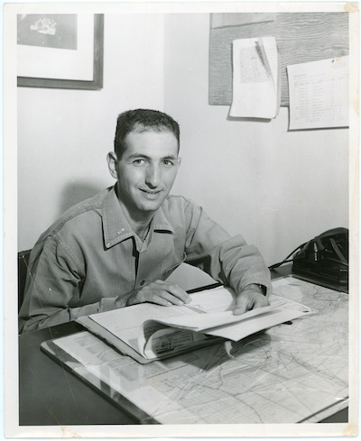
Daniel Ellsberg seated at desk, May 8, 1956. Daniel Ellsberg Papers (MS 1093). Special Collections and University Archives, University of Massachusetts Amherst Libraries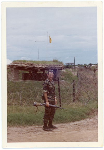
Daniel Ellsberg holding a rifle in front of bunker, ca. 1965. Daniel Ellsberg Papers (MS 1093). Special Collections and University Archives, University of Massachusetts Amherst Libraries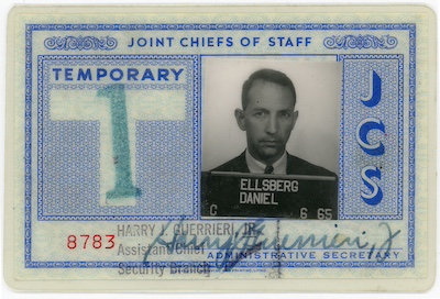
United States. Joint Chiefs of Staff. Daniel Ellsberg Joint Chiefs of Staff temporary identification card, July 1, 1965. Daniel Ellsberg Papers (MS 1093). Special Collections and University Archives, University of Massachusetts Amherst Libraries
Concluding Context:
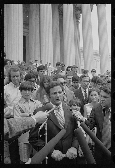
In 1969, Ellsberg decided that the public had a right to know the secret history he had read in the Pentagon Papers — he hoped disclosing that history would help end the war. In secret, he began smuggling the papers out of the office every night to photocopy them. In 1971, he gave a copy to the New York Times and then to the Washington Post. After vigorous internal debates about whether it was legal to publish these stolen and secret documents, both newspapers began running stories in June.
The Washington’s Post internal deliberations about whether to run the story are dramatized in the 2017 movie, The Post – Showing the movie to students would be a way to expand this guide to discuss the ethical obligations of journalists when it comes to publishing secret documents.
The Nixon administration’s response was extreme. They went to court to try to prevent the newspapers from publishing any more stories from the Pentagon Papers, claiming that every disclosure risked harming America’s national security. But blocking a newspaper from publishing is a heavy-handed form of censorship, known as prior restraint. And so the newspapers understandably argued that their First Amendment rights were being threatened. These questions were so fundamental, the stakes so urgent, that the case was heard by the Supreme Court less than two weeks after the first publications from the Pentagon Papers.
The rushed process produced a confusing decision. Rather than one clear majority decision, each of the justices issued their own opinion. Taken together, the court had ruled, six votes to three, that prior restraint of the Pentagon Papers was unconstitutional. Only in very particular cases, when the information published was likely to “inevitably, directly, and immediately cause” serious harm to the national security – something like “imperiling the safety of a [troop] transport already at sea” – could one justify prior restraint. The government could not show this level of harm in the Pentagon Papers case, and so the press could publish. (In fact, this bar is so high that it has never been met.) But the array of opinions left open some important questions, such as whether the newspapers could be punished for publishing state secrets after the fact, even if they could not be blocked from publishing them in the first place.
And because the decision was about the right of the newspapers to publish state secrets, it said nothing about whether Ellsberg had a right to give the Pentagon Papers to the newspapers in the first place. He was also on trial, facing 115 years in jail for giving secret information to unauthorized persons (a violation of a section of the Espionage Act). In response, he claimed a right to inform the public about government misconduct, arguing that just because a document was stamped secret didn’t mean that its disclosure would actually harm the nation’s security. In fact, he had not turned over every section of the Pentagon Papers to the press – he had only turned over those sections he believed to be wrongly classified.
The trial of Ellsberg should have been an important case, one that clarified whether government employees could claim a First Amendment right to disclose classified information to the public. Did the simple fact that a document was stamped secret mean that its disclosure posed an actual threat to national security?
To grapple with this question, students need to know how secrecy works. How does a government document become a secret? In the U.S. the process of defining secrets is guided by the classification system, which is established by Presidential order.
The first such order was passed by Harry Truman in 1951; at the time of the Pentagon Papers, the classification rules in place where those established by President Eisenhower in 1953 (seen in Exercise 2).
Exercise 2: Classifying Government Secrets
Contents:
Overview & Exercise Steps
Executive Order 10501, Annotated
Hypothetical, Alternative Executive Order
Scenarios
Debate & Conclusions
Overview & Exercise Steps:
- To explore how different classification standards can shape the practice of classification, divide the class into small groups.
- Each group will be given one of two sets of classification orders:
- One half of the groups will be given the actual classification instructions in use at the time of the Pentagon Papers case (Executive Order 10501).
- The other half of the groups will be given a fictional, revised set of instructions which ask the classifier to pay more attention to the public’s right to know.
- Note: While reformers have called for these sorts of changes over the years, no classification order has ever looked like this.
- The purpose of this exercise is to allow students to see how seemingly small changes in classification orders could change the process of stamping secrets – and so we are using a hypothetical set of orders to illustrate the point.
- Give the groups scenarios with which to test their classification instructions.
- End by encouraging students to debate the issue of classification and lead a concluding discussion.
Executive Order 10501, Annotated:
Link to Executive Order 10501
“WHEREAS it is essential that the citizens of the United States be informed concerning the activities of their government; and
WHEREAS the interests of national defense require the preservation of the ability of the United States to protect and defend itself against all hostile or destructive action by covert or overt means, including espionage as well as military action; and
WHEREAS it is essential that certain official information affecting the national defense be protected uniformly against unauthorized disclosure:
NOW, THEREFORE, by virtue of the authority vested in me by the Constitution and statutes, and as President of the United States, and deeming such action necessary in the best interests of the national security, it is hereby ordered as follows:
Section 1. Classification Categories: Official information which requires protection in the interests of national defense shall be limited to three categories of classification, which in descending order of importance shall carry one of the following designations: Top Secret, Secret, or Confidential. No other designation shall be used to classify defense information, including military information, as requiring protection in the interests of national defense, except as expressly provided by statute. These categories are defined as follows: ...
- The previous order under Truman had a fourth category - "restricted" - which this order abolished. It seems to have made little difference - classifiers simply made more use of the "confidential" stamp.
In reality, as the above photo from 1957 reveals, many different secrecy stamps and designations were adopted in the 1950s
(a) Top Secret: Except as may be expressly provided by statute, the use of the classification Top Secret shall be authorized, by appropriate authority, only for defense information or material which requires the highest degree of protection. The Top Secret classification shall be applied only to that information or material the defense aspect of which is paramount, and the unauthorized disclosure of which could result in exceptionally grave damage to the Nation such as leading to a definite break in diplomatic relations affecting the defense of the United States, an armed attack against the United States or its allies, a war, or the compromise of military or defense plans, or intelligence operations, or scientific or technological developments vital to the national defense.
(b) Secret: Except as may be expressly provided by statute, the use of the classification Secret shall be authorized, by appropriate authority, only for defense information or material the unauthorized disclosure of which could result in serious damage to the Nation, such as by jeopardizing the international relations of the United States, endangering the effectiveness of a program or policy of vital importance to the national defense, or compromising important military or defense plans, scientific or technological developments important to national defense, or information revealing important intelligence operations. ...
- My goal in teaching students how these orders work is to emphasize the subjective quality of these tests.
- The difference between the levels is vague, despite the effort to bring clarity by examples. What is a disclosure that would cause "serious damage to the Nation" as opposed to "exceptionally grave damage"? How much does it help to say that the former would "jeopardize the international relations of the US" whereas the latter would lead to a "definitive break in diplomatic relations"?
- For teachers who have also taught Free Speech Teaching Guides 1 and 2, you can note here that we are back in the world of predicting tendencies - trying to assess the likely outcome of information disclosures.
(c) Confidential: Except as may be expressly provided by statute, the use of the classification Confidential shall be authorized, by appropriate authority, only for defense information or material the unauthorized disclosure of which could be prejudicial to the defense interests of the nation.
Section 2. Limitation of Authority to Classify: The authority to classify defense information or material under this order shall be limited in the departments and agencies of the executive branch as hereinafter specified….
Section 3. Classification: Persons designated to have authority for original classification of information or material which
requires protection in the interests of national defense under this order shall be held responsible for its proper classification in accordance with the definitions of the three categories in section 1, hereof. Unnecessary
classification and over-classification shall be scrupulously avoided.”
- Note here the warning against over-classification. Even in the early 1950s, it was widely understood that over-classification was a major problem. One Defense Department study concluded that 90% of classified documents had been classified unnecessarily.
- But such warnings have not been effective in reducing over-classification. Nixon's defense secretary later conceded that 95% of the Pentagon Papers, all of which were classified Top Secret, did not need to be classified at all.
- The problem is that this warning has no enforcement mechanism. Classifiers are not instructed to actively weigh the public right to know in making a classification decision - when deciding they are instructed to think only about potential harms.
Hypothetical, Alternative Executive Order:
In determining whether to classify information, you must weigh the public’s right to know about its government’s policy – if the secrecy poses a greater risk to American democracy than the risk to national security posed by disclosure, then the material should not be classified. Wherever possible, to maximize the amount of information available to the public, only the most specific level of information should be segregated and classified secret. Illegal acts should never be classified. These categories are defined as follows:
(a) Top Secret: Except as may be expressly provided by statute, the use of the classification Top Secret shall be authorized, by appropriate authority, only for defense information or material which requires the highest degree of protection. The Top Secret classification shall be applied only to that information or material the defense aspect of which is paramount, and the unauthorized disclosure of which could result in exceptionally grave damage to the Nation such as leading to a definite break in diplomatic relations affecting the defense of the United States, an armed attack against the United States or its allies, a war, or the compromise of military or defense plans, or intelligence operations, or scientific or technological developments vital to the national defense.
(b) Secret: Except as may be expressly provided by statute, the use of the classification Secret shall be authorized, by appropriate authority, only for defense information or material the unauthorized disclosure of which could result in serious damage to the Nation, such as by jeopardizing the international relations of the United States, endangering the effectiveness of a program or policy of vital importance to the national defense, or compromising important military or defense plans, scientific or technological developments important to national defense, or information revealing important intelligence operations.(b) Secret: Except as may be expressly provided by statute, the use of the classification Secret shall be authorized, by appropriate authority, only for defense information or material the unauthorized disclosure of which could result in serious damage to the Nation, such as by jeopardizing the international relations of the United States, endangering the effectiveness of a program or policy of vital importance to the national defense, or compromising important military or defense plans, scientific or technological developments important to national defense, or information revealing important intelligence operations.
(c) Confidential: Except as may be expressly provided by statute, the use of the classification Confidential shall be authorized, by appropriate authority, only for defense information or material the unauthorized disclosure of which could be prejudicial to the defense interests of the nation.
Section 2. Limitation of Authority to Classify: The authority to classify defense information or material under this order shall be limited in the departments and agencies of the executive branch as hereinafter specified….
Section 3. Classification: Persons designated to have authority for original classification of information or material which requires protection in the interests of national defense under this order shall be held responsible for its proper classification in accordance with the definitions of the three categories in Section 1, hereof. Unnecessary
classification and over-classification are as serious a threat to American democracy as under-classification. Classification decisions will be audited, and over-classifiers will face disciplinary proceedings.
Scenarios:
Give each group three scenarios and ask whether they would classify them based on their instructions. Here are three that I use; you can develop others, of course:
- The government is secretly providing weapons to an ally that is using them to fight a regional war against a nation hostile to the US. The government credibly believes that the ally would lose the war without the weapons; that the public would not support the use of US weapons in the war; and that disclosure would therefore threaten the ally’s standing and the balance of power in the region. Should the existence of the weapons program be classified?
- The government has a program to monitor social media for threats of terrorism. It believes the disclosure of the program would impair the effectiveness of the program. Should the existence of the program be classified?
- The government has a program of placing undercover operatives in a number of foreign nations. It wants to classify the existence of the program, as well as the names of the agents and the particular countries in which they will be placed. What should be classified?
Conclusions:
Students should see that applying the standards of the Eisenhower order makes it very easy to justify classification; the fictional version of the orders introduces many more questions. For instance, in scenario three, I would think that the groups using the fictional second set of orders would be tempted to only classify the names of the officers and perhaps some of the operational details; groups using the Eisenhower order would want to classify the entire program.
I often pause here to let students debate whether it is better to be extra-cautious and deferential to national security concerns – the government does have an obligation to protect its citizens, after all – or whether transparency is more important.
To wrap up the discussion, I suggest that this is an important debate for all citizens to have an opinion about; but the point of this lesson is simply that the classification orders can have a big impact on how classification decisions are made.
And that is leaving to one-side the institutional pressures that Daniel Ellsberg discussed in his memoir. If you add those pressures to the bias created by the classification standards, students can see how easy it is to over-classify. Imagine working late in the afternoon on a stressful, difficult national security matter – would you prefer to take the risk that disclosing information poses no potential risks? Or would it be easier to stamp it classified, better safe-than-sorry?
Exercise 3: Debating the Outcome of the Ellsberg Case
Contents:
Exercise Steps
Questions & Debate
Conclusion
Exercise Steps:
- Review the Overview & Context below for yourself.
- Provide students with Overview & Context.
- Either all together or in groups, have students respond to questions and debate this topic.
- Connect this topic to the present with the Conclusion and any further discussion.
Context:
Part of what the Ellsberg case could have done was clarify whether it is illegal to disclose all classified information to the public, or only properly classified information. This is a difficult debate – because you don’t necessarily want any one government employee to decide they know what should and shouldn’t be classified. But it also seems extreme to say that once a document is classified, the public has no right to it, even if it wouldn’t actually pose a harm to national security.
In the end, the Pentagon Papers case shed no new light on these issues because it was thrown out of court. Richard Nixon had formed a small group in the White House to deal with the problem of “leaks” like Ellsberg’s. One of them told his mother-in-law that he was fixing leaks in the White House, and she said it was nice to have a plumber in the family – the group took the name “the Plumbers” as an in-joke. In an effort to discredit Ellsberg in the press, the Plumbers broke into the office of Ellsberg’s psychiatrist. Later, after the Plumbers had broken into the Watergate hotel during the 1972 election, and the whole Watergate scandal became a national fixation, the break-in at Ellsberg’s psychiatrist also came to light. The judge threw Ellsberg’s prosecution out of court for government misconduct. Ellsberg went free, but the laws of secrecy and leaking were not put to the test.
The result is that the basic classification scheme continues to operate in much the same fashion as it did in the 1960s. Subsequent presidents have tinkered with these orders – Presidents Carter, Clinton and Obama, for instance, instructed classifiers to err in the direction of under-classification when in doubt; President Reagan urged over-classification when in doubt – but none have required proactive consideration of the public’s right to know.
Was this a satisfying outcome to the Pentagon Papers affair? Richard Nixon didn’t think so: “the son-of-a-bitching thief [Ellsberg] is made a national hero and is going to get off on a mistrial. And the New York Times gets a Pulitzer Prize for stealing documents…. what in the name of god have we come to?” [I often put this quote on an overhead].
Others thought the outcome reflected a balancing act – the government retained some ability to punish leakers, and thus to keep information secret in the interests of national security. But the press had the right to publish, and thus to inform the public. Alexander Bickel, a law professor who represented the New York Times in the Pentagon Papers case, described this as a “game theory” of the First Amendment – a contest between the press and the government over who got to control what information the public learned.
One problem with this balancing act is that it requires a leaker to risk punishment to inform the press in the first place. Can we trust that people will be motivated to speak out in face of such threats? In 1971, Ellsberg was asked how he felt about facing 115 years in jail for leaking government secrets. “Wouldn’t you go to jail to help end the war?” was his famous response.
Questions & Debate:
Ask students to debate whether this is a healthy state of affairs for a democracy. The following questions could be built out to include more hypotheticals:
- Would students be willing to face jail to inform the public?
- For what sort of crimes? To end a war, to stop an abuse of power, to reveal corruption?
- Is the risk worth the reward?
- What if the paper chooses not to publish?
- Do they believe that releasing government documents actually would change public opinion? Or do they think people are so committed to their beliefs that new information wouldn’t change their mind?
- Do they trust the judgement of an individual government employee to make the decision about which secrets can be revealed? What if that employee thinks the public has a right to know, but they get this wrong, or inadvertently reveal a vital secret?
- Ask students how many Americans they think have security clearances?
- In reality, it is more than 4 million. Should each and all of them have the right to make decisions about what should be disclosed?
- Does it matter if Ellsberg wasn’t acting alone? In reality, he was working with a group of antiwar activists, who helped him smuggle the documents to the press, and who helped him go underground to avoid arrest. They represented a much broader antiwar movement which was very opposed to the war; Ellsberg was, in many ways, taking his moral cues from this broader social movement. Does that change how you think about his act of moral conscience?
- Is it enough that the source takes the secret to a journalist, and asks the journalist to decide if the information is safe to disclose?
Is that better than simply putting information online?
- Ask students how many Americans they think have security clearances?
Conclusion:
During the War on Terror, a number of government insiders have, like Ellsberg, released secret information to the public. Chelsea Manning, Edward Snowden, Terry Albury, Daniel Hale and others have faced Espionage Act charges and have not been able to claim either that the material they released was improperly classified, or that the public had a right to know. Many of them served jail time for their disclosures. The newspapers that published their leaks, meanwhile, did not face any effort to bar them from publication, or to criminally prosecute them. The balancing act created by the Pentagon Papers case lives on.
Appendix
(Both items are also available in the pdf download of this teaching guide- see left)
Image of the Pentagon Papers Cover:
Excerpt of Ellsberg Memoir:
“Even within the executive branch, self-discipline in sharing information—lack of a ”need to tell”—and a capability for dissimilation in the interests of discretion were fundamental requirements for a great many jobs. There was an abundance of people who, like John and me, could and did meet those requirements adequately. The result was an apparatus of secrecy, built on effective procedures, practices, and career incentives, that permitted the president to arrive at and execute a secret foreign policy, to a degree that went far beyond what even relatively informed outsiders, including journalists and members of Congress, could imagine.
It is a commonplace that “you can’t keep secrets in Washington” or “in a democracy,” that “no matter how sensitive the secret, you’re likely to read it the next day in the New York Times.” These truisms are flatly false. They are in fact cover stories, ways of flattering and misleading journalists and their readers, part of the process of keeping secrets well. Of course eventually many secrets do get out that wouldn’t in a fully totalitarian society. Bureaucratic rivalries, especially over budget shares, lead to leaks. Moreover, to a certain extent the ability to keep a secret for a given amount of time diminishes with the number of people who know it. As secret keepers like to say, “Three people. can keep a secret if two of them are dead.” But the fact is that the overwhelming majority of secrets do not leak to the American public. ...This is true even when the information withheld is well known to an enemy and when it is clearly essential to the functioning of the congressional war power and to any democratic control of foreign policy. The reality unknown to the public and to most members of Congress and the press is that secrets that would be of the greatest import to many of them can be kept from them reliably for decades by the executive branch, even though they are known to thousands of insiders.
As one of those insiders I had no particular objection to this. I shared the universal ethos of the executive branch, at least of my part of it: that for the Congress, the press, and the public to know much about what the president was doing for them, with our help, was at best unnecessary and irrelevant. At worst, it was an encouragement to uninformed (uncleared), short-sighted, and parochial individuals and institutions to intervene in matters that were too complicated for them to understand, and to muck them up. This sounds paternalistic to the point of being antidemocratic, and so it was. (And is: I doubt that this has ever changed.) But we’re talking foreign policy here, and national security matters, in which we didn’t see that people without clearances had any really useful role to play in the nuclear cold war era. It was in the national interest, as we saw it, simply to tell them whatever would best serve to free the president from their interference. ...
Even when I regarded the administration’s policy as inadequate or misguided, as I often did on nuclear matters, I saw little hope for improvement by Congress, with its committees generally headed by conservative southerners. Once I was inside the government, my awareness of how easily and pervasively Congress, the public, and journalists were fooled and misled contributed to a lack of respect for them and their potential contribution to better policy. That in turn made it easier to accept, to participate in, to keep quiet about practices of secrecy and deception that fooled them further and kept them ignorant of the real issues that were occupying and dividing inside policy makers. Their resulting ignorance made it all the more obvious that they must leave these problems to us.
There was one more feature of our environment within the executive branch that contributed to a disregard of the opinions or criticisms of outsiders, that made it hard to listen to or learn from them. Perhaps the most startling discovery on entering the government at this level form having been a consultant was the unrelenting pace of the work. I’ve already described the almost inconceivable amount of information and demands for information pressing on you.”


.jpg)
.jpg)