History of Education and Indigenous Americans: A Guide for Pre-Service Teachers
What is it?
Education and learning cannot be neutral. What we decide is important for young people to know necessarily reflects our values. This guide takes a look at two topics in history education of Indigenous people in the United States. First, the Federal Indian Boarding Schools which were a deliberate attempt to separate indigenous people from their communities and their cultures. The second topic is the emergence of the American Indian Movement and specifically that movement’s efforts to defend Indigenous culture and also establish schools, called “survival schools” to teach Indigenous young people about their history and culture.
Guiding questions
What is the purpose of education?
What history should be taught in schools?
Background - History of Boarding Schools 1880-1930
As the United States settlers expanded into the American West between 1865 and 1890, the federal government increasingly confined Native peoples who lived there to reservations and denied the ability to continue their livelihood through hunting and farming. In addition to this effort to separate Native Americans from their land, the government also acted to separate Native Americans from their history and culture. Indian Boarding schools were central to this effort. Beginning in the 1880s, Native children were sent to these schools typically located hundreds of miles from their parents and community with the expressed purpose of assimilating them into what the government considered to be U.S.-American culture. In order to coerce Native communities into sending their children to boarding schools, the U.S. government made basic aid such as food and supplies contingent on the reservation’s children going off to school. At these schools, the children were forced to cut their hair and take English-sounding names. Children who were caught using their given names or speaking a Native language were harshly punished. While the curriculum at each school was different, the schools tended to emphasize training in manual labor rather than academics. History, when it was taught, centered on white U.S-Americans. The fact that Native young people were separated from their elders and community meant that they did not have the same access to stories and oral traditions that they would have had they remained with their families.
Primary Source Activity:
Show students the following video (~8min) from PBS News Hour on Indian Boarding schools: https://youtu.be/gRNcCCgnauI.
When the video is over, ask the class how the boarding schools acted to separate Native children from their history and culture.
Examining Sources:
Direct the students to the following collection of primary sources related to Indian Boarding Schools. Have students choose a source and determine if it contains evidence of how Native children were separated from their history and culture:
https://www.loc.gov/classroom-materials/native-american-boarding-schools/
Along with these sources, have students consider the announcement by Secretary of the Interior Deb Haaland of the Federal Indian Boarding School Initiative:
https://www.doi.gov/priorities/strengthening-indian-country/federal-indian-boarding-school-initiative
Question when examining these sources:
- In what way are Native people advocating for a reconsideration of history of a different perspective of the past?
The American Indian Movement 1961-
From the very beginning, many Native people criticized the boarding school program and opposed the effort to assimilate Native people into U.S. culture. (See guide on Charles Eastman, Zitkála-Šá, and the Society of American Indians for more on early opposition). By the 1920s, these schools were the subject of increased scrutiny for their teaching practices, living conditions , and lack of quality medical care that led to over 500 students' deaths over the years and most were eventually closed. Beginning in the 1960s, a new movement called the American Indian Movement (AIM) began organizing for Native rights including the right for Native people to practice their culture and to emphasize history from a Native American perspective.
Timeline:
1961 - Activists Clyde Warrior (Ponca) and Mel Thom (Walker River Paiute) among others form the National Indian Youth Council. A group that would grow to 15,000 members and was one of the first Native activist groups to use direct action protest.
1968 - American Indian Movement formed in Minneapolis, Minnesota around the issue of police treatment of Native Americans.
1972 - AIM members founded two schools in Minnesota, the Little Red School House in St. Paul and Heart of the Earth Survival School in Minneapolis; Beginning in October, the Trail of Broken Treaties march ends with an occupation of Bureau of Indian Affairs headquarters in Washington, DC. AIM protestors demand that 110 million acres of land be restored to Native Americans.
1973 - At the request of Lakota elders, AIM participated in a protest against corruption within the Bureau of Indian Affairs and Tribal Council, which led to the famed 71-day occupation of Wounded Knee, South Dakota. Federal law enforcement killed two protestors and wounded 24 more.
1978 - The Longest Walk a march on Washington that began in Alcatraz Island, California and ended on the National Mall. 30,000 individuals eventually join the march. As part of the protest, a tipi was set up and maintained on the grounds of the White House.The protest called attention to legislation that would have broken Indian treaties and threatened water rights. The legislation was defeated. Two AIM leaders, Dennis Banks and Russell Means, were indicted on charges related to the occupation, but prosecutor misconduct led to the charges being dismissed.
Primary Source Activity:
Show students this brief video about Clyde Bellecourt (Nee-gon-we-way-we-dun) and the American Indian Movement.
https://www.youtube.com/watch?v=LLh3gw0kVhQ
An excellent alternative film, if your school can access it, is the 2020 documentary, Warrior Women, about Native American women activists in the American Indian Movement. https://www.warriorwomenfilm.com/synopsis
Examining Primary sources
Have students choose a primary source from the links below. As they examine or listen to the source, ask them to pay attention to how the American Indian Movement advocated for Native American culture and history. For more background on AIM, teachers may can consult this history of the movement: http://www.aimovement.org/ggc/history.html
Russell Means Radio Interview (1992)
https://americanarchive.org/primary_source_sets/american-indian-movement/2-224-257d81km
Interview of Vernon Bellecourt, AIM Leader (1973)
https://americanarchive.org/primary_source_sets/american-indian-movement/3-28-wh2d795w2v
“Survival Schools,” WGBH Journal, 1978
https://americanarchive.org/primary_source_sets/american-indian-movement/9-15-8279d3bf
“Wounded Knee,” Sunday Forum, 1973
(Pine Ridge Reservation Residents Discuss AIM)
https://americanarchive.org/primary_source_sets/american-indian-movement/6-15-78gf28x2
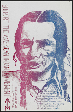
“Support the American Indian Movement” | Library of Congress
https://www.loc.gov/item/2016648080/
[Tipi with sign "American Indian Movement" on the grounds of the Washington Monument, Washington, D.C., during the "Longest walk"] | Library of Congress
https://www.loc.gov/item/2011646498/
“Prevent a 2nd massacre at Wounded Knee : show your solidarity with the Indian nations” Library of Congress
https://www.loc.gov/item/2016648079/
Protesters at Columbus landing, San Francisco, California | Library of Congress
https://www.loc.gov/item/afc1989022_kl_c104/
An American Indian Movement Wounded Knee button, 1990.
https://dp.la/primary-source-sets/the-american-indian-movement-1968-1978/sources/1338
Flag of the American Indian Movement (AIM). Image by Wikimedia Commons user Tripodero,
https://commons.wikimedia.org/wiki/File:Flag_of_the_American_Indian_Movement_V2.svg
“What we did in the 1960s and early 1970s was raise the consciousness of white America that this government has a responsibility to Indian people. That there are treaties; that textbooks in every school in America have a responsibility to tell the truth. An awareness reached across America that if Native American people had to resort to arms at Wounded Knee, there must really be something wrong. And Americans realized that native people are still here, that they have a moral standing, a legal standing. From that, our own people began to sense the pride."
AIM Leader Dennis Banks, from a 1996 interview
Wrap up
Pose the following question for students:
- What can be done today to ensure that Native culture is defended and history will be learned? This can be an end-of-class discussion or written on an exit ticket to be handed in when students leave.
Extension idea
Have students examine the resources below to learn about what’s being done to defend Native culture and spread the understanding of Native history both in the U.S. and around the world. Students could develop a project on how the education system in their state could be changed to incorporate the culture and history of Native people.
Additional resources
About Native Knowledge 360° | Native Knowledge 360° - Interactive Teaching Resources
https://americanindian.si.edu/nk360/about/native-knowledge-360
OPINION: We must support the teachers who will be in charge of expanding Native history lessons
https://hechingerreport.org/opinion-we-must-support-the-teachers-who-will-be-in-charge-of-expanding-native-history-lessons/
From United Nations Declaration on the Rights of Indigenous Peoples
https://www.un.org/development/desa/indigenouspeoples/wp-content/uploads/sites/19/2018/11/UNDRIP_E_web.pdf
Article 14
1. Indigenous peoples have the right to establishand control their educational systems and institutions providing education in their own languages, in a manner appropriate to their cultural methods of teaching and learning.
2. Indigenous individuals, particularly children,have the right to all levels and forms of education of the State without discrimination.
3. States shall, in conjunction with indigenous peoples, take effective measures, in order for indigenous individuals, particularly children, including those living outside their communities, to have access, when possible, to an education in their
own culture and provided in their own language.
General Tips for Teaching Controversial Subjects
- Center activities on primary sources. Primary sources are tangible evidence that allow students to engage directly with history. These primary sources in particular were preserved and digitized by the Library of Congress because they were deemed important to the history of the United States.
- Discussion and analysis of these sources can be wide ranging, but within each class those discussions can always be turned back to the source itself.
- The sources are also, by definition, only pieces of a puzzle. They bring us closer to understanding the past but there is always room for doubt and uncertainty.
- Questions, Observations, and Reflections should come from students. These are primarily student-directed learning activities. It is the instructor's role to create a space for inquiry and empower students to drive the inquiry.
- It may help to remind students at the outset that it is normal for different individuals to come to different conclusions, even when we are looking at the same sources. Further, it would be strange if we all agreed completely on our interpretations. This can normalize the strong reactions that can come up and enables educators to discuss the goal of historical research, which is to hopefully go beyond the realm of individual perspective to access a fuller understanding of the past that takes multiple perspectives into account.
- Teaching historical topics that involve violence and other trauma can be traumatic for some students as well. Providing students with previews of what content will be covered and space to process their emotions can be helpful. The following video series from the University of Minnesota contains further tips for teaching potentially traumatic topics: https://extension.umn.edu/trauma-and-healing/historical-trauma-and-cultural-healing.