Free Speech Teaching Guide 4: Mandel v. Kleindienst (1972): Censorship via Visa
This Teaching Guide is part of a series. Each of the four total teaching guides speaks to one aspect of the history of free speech. Although they work together to tell different parts of this history, it is not necessary to teach all of the guides or to teach them in a certain order. Each guide is a self-contained lesson.
(A PDF version of this teaching guide is also available for download-see left)
Other guides in the series:
Free Speech Teaching Guide 1: The Birth of the Modern First Amendment: How Oliver Wendell Holmes Changed His Mind
Free Speech Teaching Guide 2: Brandenburg v. Ohio (1969): Defining and Arguing Hate Speech
Free Speech Teaching Guide 3: The Problem of National Security Secrets
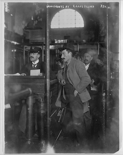
"Male Immigrants at Ellis Island," Library of Congress
Recommended for:
- 11th Grade US History
- 12th Grade US History
- Undergraduate History
Table of Contents
Guide Introduction:
This introduction briefly previews the topics included in this guide that spans the twentieth century and ends with a 1972 Supreme Court Case.
Classroom Activities
Exercise 1: "The unrestricted dumping-ground" (1903). A guided analysis of a 1903 political cartoon with annotations and questions. Why was immigration a heated debate in the early twentieth century?
Exercise 2: Who gets a Visa? A close reading of an excerpted 1984 article with guiding questions, notes, and class discussion options. Why deny visas?
Optional Exercise: Visa Waivers. Ask students to consider the more complicated reality of the visa law. How did waivers work and did they undermine political exclusion?
Framing Essay
Scholarly Context: How do visa laws and the First Amendment connect? An introduction to the Mandel Supreme Court case.
Annotated Decision: Notes on the Mandel SCOTUS decision for context or to help guide a close reading.
Key Takeaways: Concluding connections between immigration law and free speech law and prompts for class discussion.
Guide Introduction
Throughout the 20th century, the U.S. government has denied visas to individuals because of their politics: anarchists in the early 20th century, communists in the Cold War, those it deemed advocates of terrorism in the 1990s and early 2000s. In the first half of 2025, the Second Trump Administration began seeking to deny visas to students and others engaged in pro-Palestinian advocacy during the war in Gaza.
To be denied a visa means either that you can’t enter the country, or that you can be deported. Governments claim that this use of the visa regulations is simply a part of their control over immigration policy – they have a right to determine who can enter the country. Critics and civil liberties activists argue that it is a form of censorship, one that should be barred by the First Amendment. The relationship between visa laws and free speech was most closely examined in a 1972 case Mandel v. Kleindeinst. The case is also significant because it focused on a neglected aspect of the right to free speech – not the rights of the speakers to say what they want, but the rights of listeners and audiences to hear what they want.
This guide traces the history of ideological visa denial to explore the intersection between immigration law and the right to free speech. It includes:
- An overview of the history of visa denial in early 20th century, which allows students to assess historical fears of radical immigrants through the close reading of a political cartoon.
- A discussion of the denial of visas to communists and alleged radicals in the Cold War, through a classroom exercise and discussion of an excerpted newspaper article.
- An assessment of the role of the First Amendment in challenging visa restrictions through a close reading of a Supreme Court decision in 1972.
Classroom Exercise I: "the unrestricted dumping-ground" (1903)
Contents:
Overview
Annotated Cartoon
Questions for Students & Extended Context
Overview:
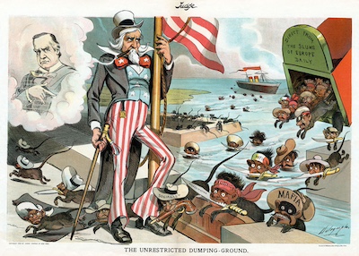
The first efforts to exclude radicals from the United States came in 1903, when Congress passed a law barring anarchists from entering the country. This was a response to the assassination of President McKinley in 1901, which played into widespread anxieties that radical ideologies and crime were being brought to the country by immigrants. This 1903 cartoon captures the mood. The following pages include my annotations, as well as questions I use.
- Have students examine the cartoon individually or in groups.
- Invite students to share what they notice and ask more specific questions to guide conversation. This should mimic a close reading.
For the Printable Image See: linked source
Annotations:
- McKinley assassination
- McKinley (or McKinley’s ghost) is depicted in the top-left.
- Leon Czolgosz, the gunman, was born in Detroit, but was the child of immigrants.
- The cartoon, however, suggests the threat of anarchism is coming from immigrants, a widespread assumption at the time. “There is no such thing as an American anarchist,” said one newspaper column.
- Both the container label “direct from the slums of Europe daily” and the title of the cartoon advocate for immigration restriction.
- Depiction of Immigrants
- McKinley and Uncle Sam are depicted as white, compared to the darker-skinned immigrants. At the time, most concern was about immigration from the south and east of Europe – groups that would later be considered white, but which were then treated as distinct races.
- Immigrants are drawn to be animalistic, communicating an idea that they were less human and more threatening than white Americans.
- Politics & crime:
- Three migrants at the bottom are labeled “socialist,” “anarchist,” and “mafia,” associating socialists and anarchists with crime. The socialist carries a gun labelled “murder;” the anarchist a knife labelled “assassination,” further associating these political ideologies with violence.
- There were radical leftists committed to political violence at the time. One wing of the anarchist movement, for instance, engaged in what it called “propaganda by the deed” – symbolic acts of political violence. Between 1880 and 1910, anarchists assassinated heads of state in Austria, Italy, Greece, France, Spain, Russia (twice), and Portugal – as well as McKinley in the U.S.
- While many radical leftists rejected political violence, this cartoon suggests they were all criminals.
By the early Cold War, the bar on anarchists entering the country remained, and had been expanded to include Communists and advocates of communist revolution. The visa had also become a more powerful bureaucratic instrument. During World War I, for the first time the U.S. began requiring all visitors to the U.S. to receive a visa, which allowed a new degree of oversight and examination of applicants. A new Visa Division was created in the State Department to do this work.
Questions for Students:
- How are immigrants depicted?
- What is this cartoon arguing?
- Would immigration restriction be a useful remedy to the problems revealed by McKinley’s Assassination? What would have to be true for it to be effective for this purpose? What other remedies might be available?
Classroom Exercise II: Who gets a Visa?
Contents:
Overview
Excerpted Newspaper Article
Guiding Questions, Notes, & Class Discussion
Overview:
A close reading of a later news article brings the topic of immigration and citizenship closer to the modern day for students. This exercise is centered around an excerpted 1984 newspaper article that discusses some individuals who were denied visas as well as efforts to reform the law. The article, like the cartoon in exercise 1, thus reveals some of the political dynamics involved.
The next page includes some reading questions (as well as additional notes I might add), followed by a question for in-class discussion.
Excerpted Newspaper Article:
Kristin Helmore, “Would William Shakespeare get a Visa?” Christian Science Monitor, May 30, 1984.
WALK into any bookstore in the United States and the works of Nobel Prize-winners Gabriel Garcia Marquez of Colombia and Pablo Neruda of Chile will be easily available. Anyone who wants to can buy Mexican novelist Carlos Fuentes's works or those of Italian writers Alberto Moravia and Dario Fo. And the titles of books by English novelist Graham Greene are almost household words in this country. Yet each of these acclaimed writers, and many others as well, has on at least one occasion been denied an entry visa to visit the United States.
The law responsible for this policy is a section of the McCarran-Walter Immigration and Nationality Act of 1952, which some people would like to change. A bill has been introduced in Congress to do just that.
''Section 28,'' as it is called, empowers consular officials to refuse non-immigrant visas to foreigners who are or have been members of ''communist'' or ''anarchist'' organizations, as well as those who merely ''write, publish . . . circulate, display, or distribute . . . any written or printed matter advocating or teaching opposition to all organized government.'...
The exclusion of writers from the US on ideological grounds can take place for a number of specific reasons. According to data collected by PEN, an international association of writers with offices in 55 countries, Gabriel Garcia Marquez was denied entry to the US from 1963 to '71 because of his affiliation with the leftist news agency La Prensa. Since that time, he has been granted entry only on presentation of a formal letter inviting him to a specific event. Last month, Mr. Garcia Marquez was denied entry into the US to speak at a meeting in New York on US policies in Latin America. Finally, in late April, he was granted a multiple-entry visa for one year.
Pablo Neruda, the late Chilean poet and diplomat, was denied entry on the basis of his membership in the Chilean Communist Party. This ruling was waived on two occasions, in 1966 and '72, as a result of petitions put forward by PEN. ...
Since 1961, Carlos Fuentes, the Mexican author and politician (who virtually grew up in Washington where his father was Mexican ambassador), has either been denied a visa to the US or issued restricted visas, even though he has been invited on numerous occasions to make public appearances under the auspices of respected institutions. He has received an honorary degree from Harvard University and was recently a visiting scholar at Princeton University. ...
''It's a scandal and a hateful thing for a democracy to perpetuate this kind of exclusionary policy,'' [novelist William] Styron said. ''It allows the United States to be branded as a bigoted nation filled with hysteria about communism.'
Both Arthur Miller and John Irving raised the specter of McCarthyism. ''I doubt strongly that this law could have been passed before 1952, the wildest time of McCarthyism . . . but it's hung on the books because most people aren't aware of it,'' Mr. Miller said.
''I hope it's clear that we would improve our national character by ridding ourselves of these vestiges of McCarthyism which shame us today,'' Mr. Irving said.
Carolyn Forche remarked, ''I am puzzled as to why my government is afraid of a free exchange of ideas. I would hope that my country and its institutions are strong enough to endure freedom of expression.' ...
Support for the existing law was recently expressed on ABC's ''Nightline'' by Roy Cohn, counsel in the early 1950s to the Senate's Permanent Investigations Subcommittee headed by the late Joseph R. McCarthy: ''This law is aimed at people who present a threat to national security. Under various circumstances they should not be let in. They have access to courts where their visa denial can be overruled.' ….
Opposition to Section 28 of the McCarran-Walter Act has a long history. In 1952, President Harry S. Truman vetoed the act, remarking, ''Seldom has a bill exhibited the distrust evidenced here for aliens and citizens alike.'
Congress overrode Mr. Truman's veto."
Guiding Questions, Notes & Class Discussion:
- Who are some individuals who have been denied visas?
- Besides those named in the article, some famous individuals (though perhaps not famous to students today) include Charlie Chaplin, Pablo Picasso, Dorris Lessing, Nazim Hikmet, Czeslaw Milosz, C.L.R. James.
- What law was used to deny their visas?
- The 1952 Immigration and Nationality Act consolidated all previous immigration laws – including the Anarchist Exclusion Act of 1903 and an Internal Security Act of 1950.
- It was passed over Truman’s veto – a place to discuss the veto power with students if you think appropriate.
- Why do civil liberties groups want to reform the law?
- Beyond discussions of the impact of the law on the individuals involved, I make sure to draw student attention to William Styron’s argument that the law makes America look bigoted and intolerant.
- Why does Roy Cohn say we need such a law?
- How does this perspective complicate or affirm students’ thoughts on this debate?
Class Discussion:
- Do students think denying visas under this law is a good or a bad thing?
- Do they agree that there are national security grounds under which someone should be denied entry to the country? Do those grounds extend to political beliefs?
- If you have used the other Free Speech Teaching Guides that cover Schenk v. US and Brandenburg v. Ohio, this is an opportunity to discuss what "harm" the law is intended to prevent.
Optional Exercise: Visa Waivers
The visa law had a waiver process. If you were denied a visa because you were a member of a communist party, the Attorney-General could issue a “waiver” – letting you into the country just this time.
If students are opposed to the law, you can ask them if this waiver process is enough to satisfy them?
There was some dispute over how frequently this process was delayed, and how many waivers were granted. But many were granted waivers. However, an additional concern was that the Attorney-General could attach conditions to the waiver – saying visitors could not travel to certain areas, or engage in certain types of activities. (we will see an example of these conditions in the Mandel case).
Framing Essay
Scholarly Context:
How did these visa laws intersect with the First Amendment? They are clearly a form of punishment for political speech. As early as 1903, an anarchist being deported under the anarchist exclusion law claimed that his First Amendment rights were being violated. The Supreme Court ruled that foreigners could not claim First Amendment rights to stay in the country. As we discussed in the guide, Schenk v. U.S. (1919): The Birth of the Modern First Amendment, this was typical of the narrow way that the Supreme Court protected First Amendment rights before the mid-twentieth century. And in 1945, in a case concerning an attempt to deport an Australian labor leader, the Supreme Court said that noncitizens in the U.S. have the same First Amendment rights as citizens. Of course, in the early 1950s, American citizens didn’t have the right to advocate for Communism, and so many communists were deported in the McCarthy period, just as many Americans citizens were jailed. Today, the standards would be different.
Find the text of the First Amendment Here
But what about the rights of the foreigner to enter the country? Here, courts have rejected the notion that foreigners can claim a First Amendment right to come into the U.S. if the U.S. has a law that would exclude them. The Supreme Court has ruled that the right to determine who can and can’t enter the country is what it calls the “Plenary Power” – part of what it means to be a government of a nation-state is the right to choose who can enter the country, and no court can interfere with those decisions.
That has meant that foreigners can’t claim a First Amendment right to enter the country (they can claim such a right if they are being deported after entering, though the law is complex in this area.) But in the late 1960s, a group of university professors tried a different strategy to challenge the visa laws. They had invited Ernest Mandel, a Belgian Marxist theorist, to come to their campuses to give talks and engage in debates. Mandel was denied a visa because he advocated world communism.
Note (if you discussed the waiver program earlier):
Mandel had been given waivers to enter the country in 1962 and 1968. But in 1969 he was denied a waiver. This was because 1) in 1968 he spoke at more universities than his waiver granted, and 2) after one of these talks, students auctioned posters to send money to French protestors – which violated a condition attached to Mandel’s waiver that he not speak at events where funds were raised for political causes. Mandel had not been told that these conditions were attached to his waiver. This can be a place to return to your discussion of the waiver program, to see if these details change or reinforce students’ earlier attitudes.
Annotated Decision:
Mandel, as a foreigner, couldn’t claim his First Amendment rights were violated by his exclusion from the country. But the university professors argued that their rights were violated by his exclusion from the country – they wanted to listen to him, to talk to him, to meet with him. A lower court agreed with them, ruling that Mandel’s exclusion violated the First Amendment. The government appealed to the Supreme Court, which ruled 6-3 that Mandel’s exclusion was constitutional. Here’s what the Supreme Court said, along with some notes I use to teach the decision:
The decision text:
"The case…comes down to the narrow issue whether the First Amendment confers upon the appellee professors, because they wish to hear, speak, and debate with Mandel in person, the ability to determine that Mandel should be permitted to enter the country or, in other words, to compel the Attorney General to allow Mandel's admission. ….
The Government also suggests that the First Amendment is inapplicable because appellees have free access to Mandel's ideas through his books and speeches, and because 'technological developments,' such as tapes or telephone hook-ups, readily supplant his physical presence. This argument overlooks what may be particular qualities inherent in sustained, face-to-face debate, discussion and questioning. While alternative means of access to Mandel's ideas might be a relevant factor were we called upon to balance First Amendment rights against governmental regulatory interests—a balance we find unnecessary here in light of the discussion that follows in Part V—we are loath to hold on this record that existence of other alternatives extinguishes altogether any constitutional interest on the part of the appellees in this particular form of access."
Recognition that First Amendment rights are implicated, however, is not dispositive of our inquiry here. In accord with ancient principles of the international law of nation-states, the Court in The Chinese Exclusion Case 1889, and in Fong Yue Ting v. United States (1893), held broadly…that the power to exclude aliens is 'inherent in sovereignty, necessary for maintaining normal international relations and defending the country against foreign encroachments and dangers—a power to be exercised exclusively by the political branches of government.' ...
In summary, plenary congressional power to make policies and rules for exclusion of aliens has long been firmly established. In the case of an alien excludable under § 212(a)(28), Congress has delegated conditional exercise of this power to the Executive. We hold that when the Executive exercises this power negatively on the basis of a facially legitimate and bona fide reason, the courts will neither look behind the exercise of that discretion, nor test it by balancing its justification against the First Amendment interests of those who seek personal communication with the applicant. What First Amendment or other grounds may be available for attacking exercise of discretion for which no justification whatsoever is advanced is a question we neither address or decide in this case.”
Annotations:
- ["This argument overlooks what may be particular qualities inherent in sustained, face-to-face debate, discussion and questioning."]
- The Government was claiming that the professors could speak to Mandel just as easily by telephone, and so his presence was not necessary. The court is skeptical of this claim.
- In the era of zoom, do students think there is any benefit to in-person conversation? or is online discussion good enough?
- The Government was claiming that the professors could speak to Mandel just as easily by telephone, and so his presence was not necessary. The court is skeptical of this claim.
- ["Recognition that First Amendment rights are implicated..."]
- The Supreme Court concedes here that there is a First Amendment right to hear Mandel. There are a number of other cases in the period which emphasize that the right to speak matters not for the speaker, but for the audience - that the First Amendment is important for its role in preserving a broader culture of debate and exchange.
- Many students will think only about the rights of the speaker, so this is an important place to slow down and demonstrate how many more rights are involved.
- ["The Chinese Exclusion Case 1889, and in Fong Yue Ting v. United States (1893)..."]
- These are important late nineteenth century cases which established the Plenary Power. Congress passed the Chinese Exclusion Act in 1882, barring Chinese entry to the country. In these legal cases, courts said that they could not overrule political decisions made by Congress as to who could enter the country.
- ["facially legitimate and bona fide reason..."]
- This is a very deferential standard. In other first amendment cases, the Supreme Court has carefully scrutinized the government's rationale for a law, to make sure it isn't a cover for political discrimination. But here, the court says explicitly that if the government offers a justification that seems reasonable, the courts will not look any closer, or consider the First Amendment.
- In dissent, Justice Marshall was very critical of this approach:
- "I do not understand the source of this unusual standard. Merely 'legitimate' governmental interests cannot override constitutional rights. Moreover, the majority demands only 'facial' legitimacy and good faith, by which it means that this Court will never 'look behind' any reason the Attorney General gives. No citation is given for this kind of unprecedented deference to the Executive nor can I imagine (nor am I told) the slightest justification for such a rule."
- ["What First Amendment or other grounds may be available for attacking exercise of..."]
- This is an ambiguous final sentence, which can be used to help students understand the difficulty in working out how much precedent a given case is setting.
- This sentence seems to leave open the possibility that there are some instances of visa denial which would raise First Amendment concerns - those in "which no justification whatsoever is advanced." But under what circumstances would a justification fail to be "facially legitimate and bona fide"?
- The Court has never revisited the visa denial process, so the meaning of these sentences remains unresolved.
Key Takeaways:
- Visa denial is at the crossroads of two discrete fields of the law: immigration law and free speech law.
- In immigration law, courts have been very deferential to the power of the government to decide who can enter the country; in free speech law, courts have been very skeptical of government claims that it needs to regulate debate and discussion.
Do students think cases like Mandel’s – or more recent cases, if there have been some in the news – are better treated as First Amendment or immigration cases? Or do they think that these two areas of the law should be combined?
- This can be an interesting place to leave the class discussion – asking students both to consider their own values in this complex area, and also to show them how the answers to legal questions are often shaped by the ways that courts and lawyers sort them into different doctrinal domains.


.jpg)